How to Combine Colors in Your Graphic Designs

 2.00/5 (1 votes)
How to make your graphic design come alive and evoke the exact feelings you had in mind while creating it? One of the secrets is to choose the right color palette! Whether you’re working on a romantic postcard or a dynamic poster bursting with color, it takes a trained eye to bring together perfect tones and drive your message home. Although combining colors isn’t the thing that just comes natural, like any other skill, it can and SHOULD be learned. Here are five tips on how to combine colors like a pro and create breathtaking designs.
Tip 1. Get Acquainted with the Color Theory
For a start, it’ll be great to refresh your knowledge of the basic color wheel. You’ve probably studied it at school, but it couldn’t hurt to look back at the basics. Red, blue and yellow are called primary colors as they cannot be made by mixing other colors. Secondary colors, including orange, green and violet, are a blend of two primary colors. Tertiary colors like blue-green or red-orange are derived when a primary color is combined with an adjacent secondary color.
Black, white and gray are considered to be neutral hues and aren’t included into the above groups. All colors also have tints (the original color mixed with white), shades (that color blended with black) and tones (when you add both black and white to the initial hue). For example, azure is a tint of blue. If you add black to the original color, you’ll get sapphire which is a shade of blue. I mention these basics so that they can guide you in making color choices later on.
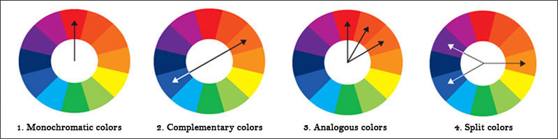
Tip 2. Use Color Wheels and Ready-Made Palettes
Imagine that you’ve picked a perfect font and now try to fit it into your design, but the text color and background image just don’t go together. To avoid this mess, you should choose a new hue that will look natural when combined with others. An easy way to find complementary colors is to use a color wheel or browse through some ready-made palettes. Complementary colors are positioned on the opposite sides of the color wheel. You can achieve a striking result if you combine a color from the center, like a soft violet, with its complementary color from the outside edge, like a mint green.
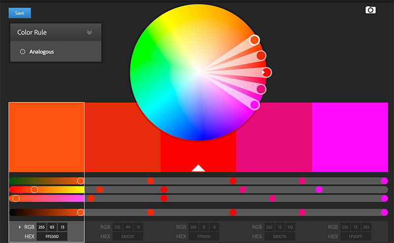
There’re plenty of tools and online services that show you how to combine colors and make professional graphic designs. For example, try Adobe Color CC: https://color.adobe.com to find the best complementary colors or replace the chosen hue with its tint. If you’re looking for ready-made solutions, you can check out Colour Lovers: http://www.colourlovers.com where users upload the color schemes they used and liked. You’re also welcome to share your color palettes!
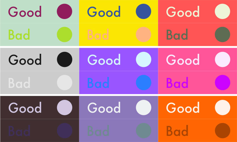
Tip 3. Play with Contrasting Colors
When combining two or more colors it’s crucial to have good contrast. Even if you have a fantastic background, but can’t pick a proper additional color that is not overpowered by this background, your design won’t be legible and clean. One of possible solutions is to choose a darker tone of the background color and achieve improved contrast. The main challenge is that most backgrounds are not uniform, and the new color you use may not work across the entire area. So it’s better to match colors, or to choose one overall color, but you should make sure it works on the entire design.
Tip 4. Take a Look at the Natural Color Combinations
There’s no need thinking up something new if it’s already made by someone else. In this case, Mother Nature has done us all a favor and created tons of color mixes we can adopt. If you take a look around, you’ll instantly notice that our everyday life is filled with beautiful things. It can be a meadow covered with flowers, a breathtaking mountainous landscape or an elegant plant.
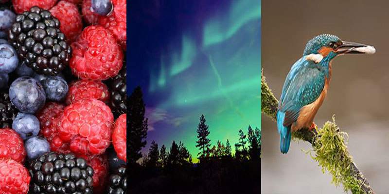
Our colleagues at Canva have done the hard work and gathered 100 best color combinations inspired by nature itself: https://designschool.canva.com/blog/100-color-combinations/ Here you’ll find really beautiful color palettes that can easily inspire you. Using nature as a guide, you can create a palette you’ll work with and later adopt into your graphic design.
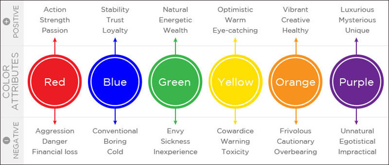
Tip 5. Pay Attention to the Meaning of Colors
In order to learn how to combine colors you should pay attention to the meaning of the hues you’re going to use. The perception of colors is very subjective, and the same thing can evoke different reactions. It means that something considered happy and uplifting in one country can be quite depressing in another. However, all the colors can be divided into two major groups: cool and warm. While warm colors like red, yellow or orange often reflect passion, enthusiasm and happiness; cool colors include green, blue and purple, are more subdued. They are usually seen as calming, relaxing, and somewhat reserved. Think over the mood of your overall design and pick suitable colors.
Now that you’ve learned how to combine colors in graphic designs, you can successfully use this knowledge outside the realm of design. When thinking over your outfit, remember these tips and you’ll never have to wear just black and gray because you’re dead sure they go together. Do you know any other secrets of how to make mixing colors easier? Share your creative ideas in the comments and help novice designers blend colors like a pro!